
Designing a menu that sells: 9 rules of menu engineering
Your card is the only commercial support that each customer reads, alone, at the precise moment when they decide how much to spend. It’s your best seller — and most often overlooked. Here are nine rules from the engineering menu, applicable from your next reprint.
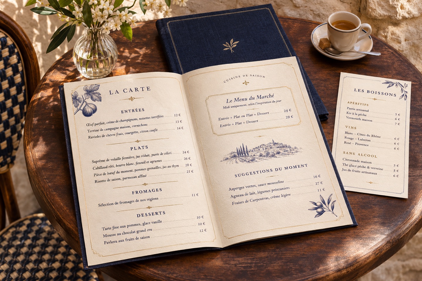
The essentials in thirty seconds
- Maximum seven dishes per category
- No euro symbol, no aligned price column
- Your profitable dishes at the top right and at the head of the section
- A short, concrete description, without hollow adjectives
- One or two framed dishes, no more
- A card must be read in ninety seconds
1. Seven dishes per category, no more
Beyond that, the choice becomes an effort. A customer who hesitates for too long falls back on what they know — often the cheapest option. A short menu speeds up service, reduces waste in the kitchen and increases the proportion of dishes you want to sell.
2. Remove the euro symbol
Writing “18” rather than “18,00 €” reduces the salience of the price at the time of choice. This is a common practice in fine dining. It remains compliant with the display obligation: what matters is that the price is legible and unambiguous.
3. Never align prices in columns
A right-aligned column of prices prompts you to read the numbers vertically and choose the lowest. Place the price immediately following the description, in the same body of text: the customer then reads the dish, then its price — in that order.
4. Place your profitable dishes where the eye lands
On a two-panel card, the eye naturally goes to the top right. At the head and end of the section, attention is also stronger than in the middle. Reserve these slots for the high-margin dishes you know best.
5. Frame one dish, not five
A frame, a color or a background catches the eye — as long as it is unique. Five framed dishes highlight nothing: they cancel the effect and weigh down the layout.
Do you want to know what this would look like in your home?
We look at your map, your networks, your Google listing and your storefront, and we tell you frankly what deserves to be taken up first. It's free, and the balance is yours even if you don't follow up.
Request my free assessment →6. Describe concretely, without empty adjectives
“Delicious”, “tasty”, “unmissable” teach nothing. Name the origin, the preparation, a true detail: “Apulian burrata, candied tomatoes, garden basil”. The reader sees the dish, and a concrete description justifies the price much better than a superlative.
7. An anchor price at the top of the card
Placing an exceptional dish at the top of the section makes the other prices more reasonable by comparison. This dish doesn't need to be your best seller: it does its job just by being read.
8. The card must be read in ninety seconds
Beyond that, attention disperses and the table hesitates. Time it: Give your card to someone who doesn't know it and see how long it takes them to choose. It's the most useful test you can do, and it's free.
9. The printed card, the screen and the delivery must say the same thing
This is the most common and costly error: an up-to-date menu in the restaurant, outdated prices on Uber Eats, an old menu on the Google page. Every deviation produces disappointment, and disappointment produces opinion. A map is updated everywhere, on the same day.
The test to take this evening
Take your current menu and ask yourself three questions: What are my three most profitable dishes? Where are they placed on the map? How long does it take a stranger to choose? If the three answers do not satisfy you, the map is your most profitable project - before any advertising campaign.
Frequently asked questions
How to design a restaurant menu that sells?
Limit each category to seven dishes, remove the euro symbol and align prices at the end of the description rather than in a column, place your most profitable dishes at the top right and at the beginning of the section, and only frame one or two dishes per menu. A map that can be read in ninety seconds sells better than an exhaustive map.
How many dishes do you need on a menu?
About seven per category. Beyond that, the choice becomes mentally costly and the customer falls back on what they know, often the cheapest dish. A short menu also speeds up service and reduces waste in the kitchen.
Should we display the euro symbol on a map?
No. Writing “18” rather than “18,00 €” reduces the salience of the price at the time of choice. This is a common practice in fine dining, and it remains perfectly compliant with the obligation to display prices, which relates to the readability of the information, not to the presence of the symbol.
How often should you change your card?
Two to four times a year is enough to follow the seasons. On the other hand, prices and daily specials must be accurate at all times, including on delivery platforms and the Google listing.
See our menu design services, from 290 € excluding VAT.
Ready to take back control of your image?
A free visual assessment of your current presence — offered, without obligation. We show you exactly what ARTSTRIA would change for you.
Request my free assessment →contact@artstria.com · Monday–Friday, 9am–7pm